How To: Exploring Drought using the Climate Engine Web App

Climate Engine provides streamlined access to more than 50 drought-related datasets, covering variables such as precipitation, evapotranspiration, potential water deficit, and standardized drought indices. These data can be used to calculate anomalies, trends, percentiles for specific time periods, providing insight on drought development and status for spatially explicit areas.
This article walks through examples of how to create maps and charts in Climate Engine to track how drought is evolving in a given area. The NOAA NIDIS 2017 Northern Plains Flash Drought Report serves as the guiding example throughout.
Example Background
In early 2017, the Northern Plains and Upper Midwest began the growing season with near-normal conditions, but by April–May unusually warm temperatures, strong winds, and low humidity rapidly increased evaporative demand. Soil moisture declined quickly despite limited early precipitation deficits, leading to rapid vegetation stress and the onset of a flash drought within weeks.
By June–July, drought conditions intensified across Montana, the Dakotas, and surrounding areas, causing major agricultural, rangeland, and wildfire impacts. The U.S. Drought Monitor captured the rapid escalation by incorporating impacts and soil moisture, while some precipitation-based indices lagged, highlighting the importance of temperature-driven indicators in flash drought monitoring.
Precipitation Timeseries
Head to app.climateengine.org
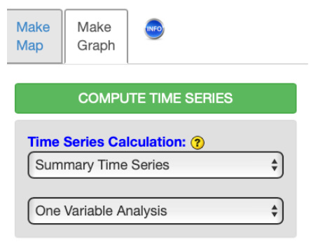
Click on the Make Graph tab on the left-hand panel.
Select Summary Time Series and One Variable Analysis as Time Series Calculation inputs.
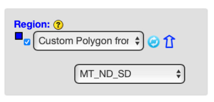
Select Custom Polygon from Shapefile option as Region input. Click the blue arrow and follow the directions to upload your shapefile.
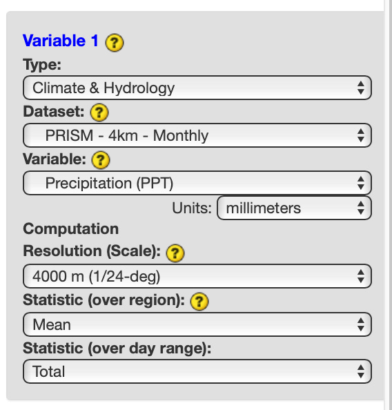
Select Climate & Hydrology as Variable 1 Type input. Select your dataset of interest, in this example we will use PRISM - 4km - Monthly as Dataset input. Select Precipitation as Variable input. Leave the Resolution, Statistic (over region), and Statistic (over day range) as the defaults. Skip the optional Masking section.
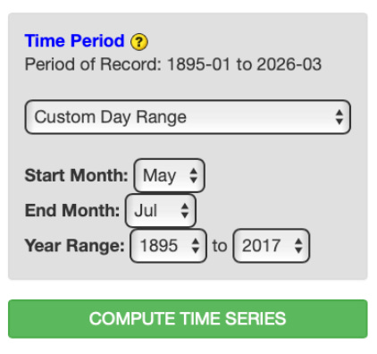
Select Custom Day Range as the Time Period. Select May as the Start Month input. Select July as the End Month input. Select 1985 and 2017 as the Year Range inputs. Click COMPUTE TIME SERIES to submit your selections and have the output added to the right panel.
Output :
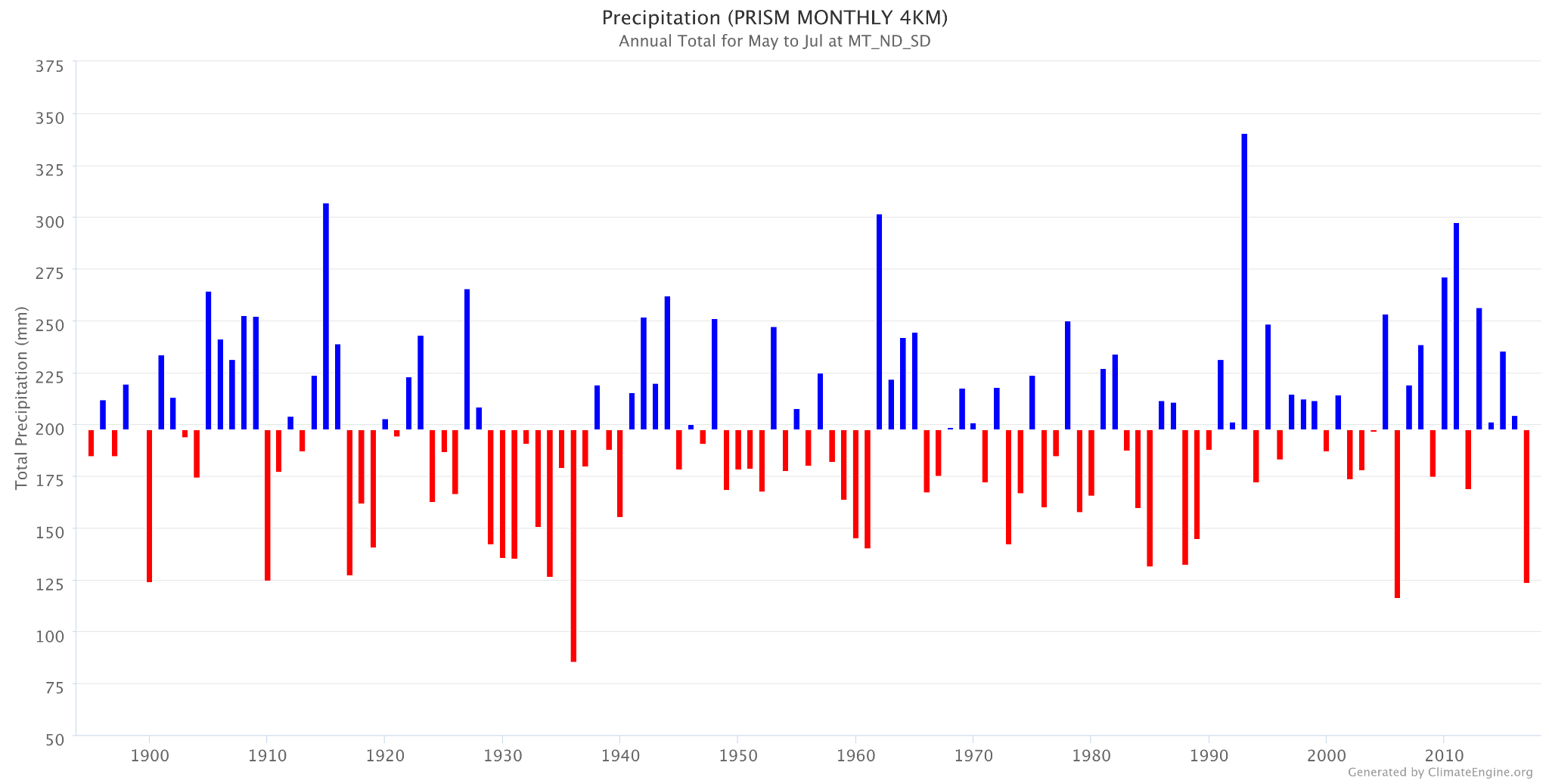
This chart highlights a lower than average precipitation for the May - July months in 2017.
Temperature Timeseries
Repeat the step outlined above, updating the Variable input under Variable 1 to Mean Temperature. Click COMPUTE TIME SERIES to submit your selections.
Output:
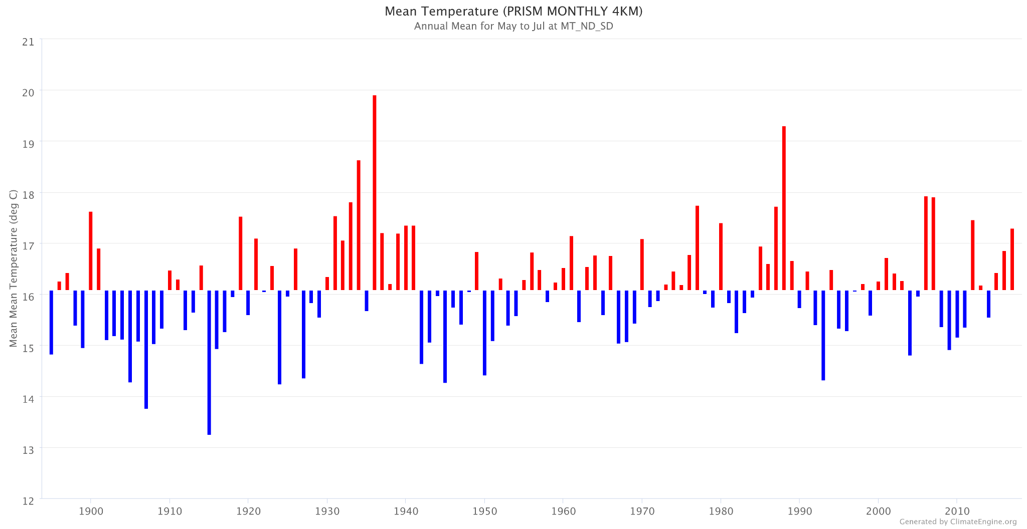
This chart highlights a higher than average temperature for the May - July months in 2017.
US Drought Monitor
Head to app.climateengine.org
Click on the Make Map tab on the left-hand panel.
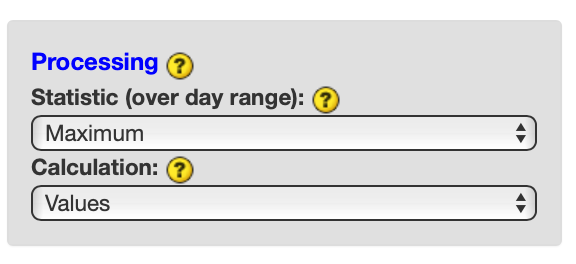
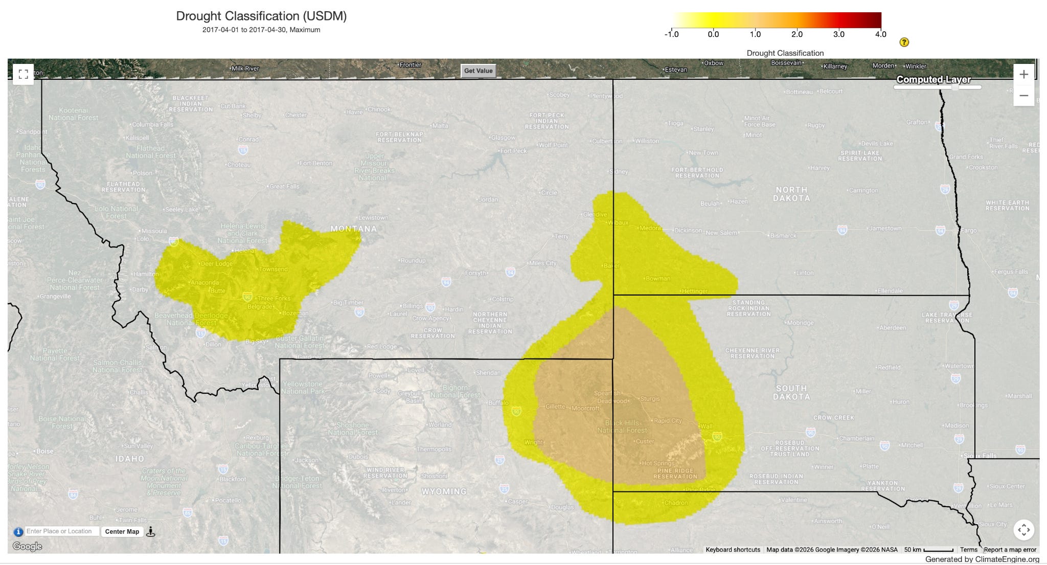
Select Climate & Hydrology as the Type input. Select USDM - 2.5km - Weekly as the Dataset input. Select Drought Classification as the Variable input.
Select Maximum as the Processing Statistic (over day range) input and Values as the Calculation input. Skip the optional Masking section.
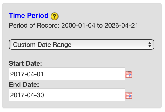
Select Custom Day Range as the Time Period. For Start Date input, select 2017-04-01. For End Date, select 2017-04-30. Click COMPUTE MAP to submit your selections.
Over the right map panel, click on Map Overlays. Under the Vector section, expand Boundaries > US (Contiguous States) and check on US States.
Repeat process for following time periods: April 2017 (https://climengine.page.link/wgZo), May 2017 (https://climengine.page.link/VWQ3), June 2017 (https://climengine.page.link/t2t5), July 2017 (https://climengine.page.link/KQmS), August 2017 (https://climengine.page.link/jGbs), September 2017 (https://climengine.page.link/LQac)
Output:
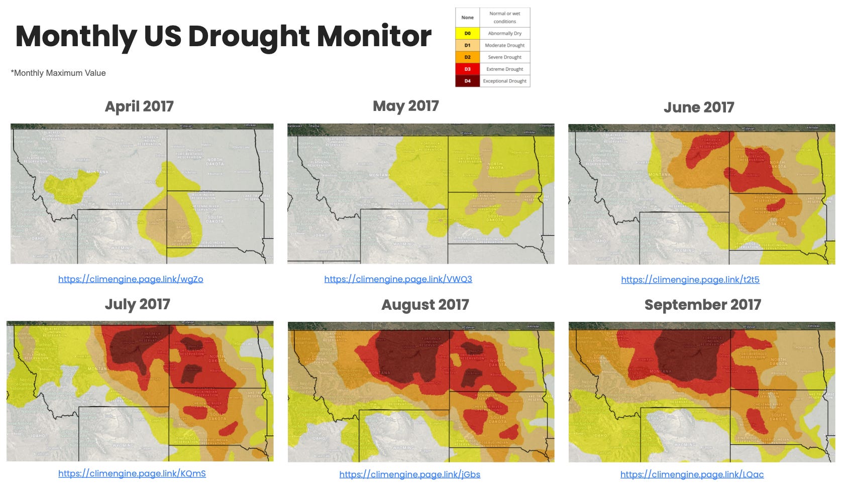
This series of maps highlights the progression drought into extreme and exceptional categories across the northern plains as well as expansion of abnormally dry through severe drought.
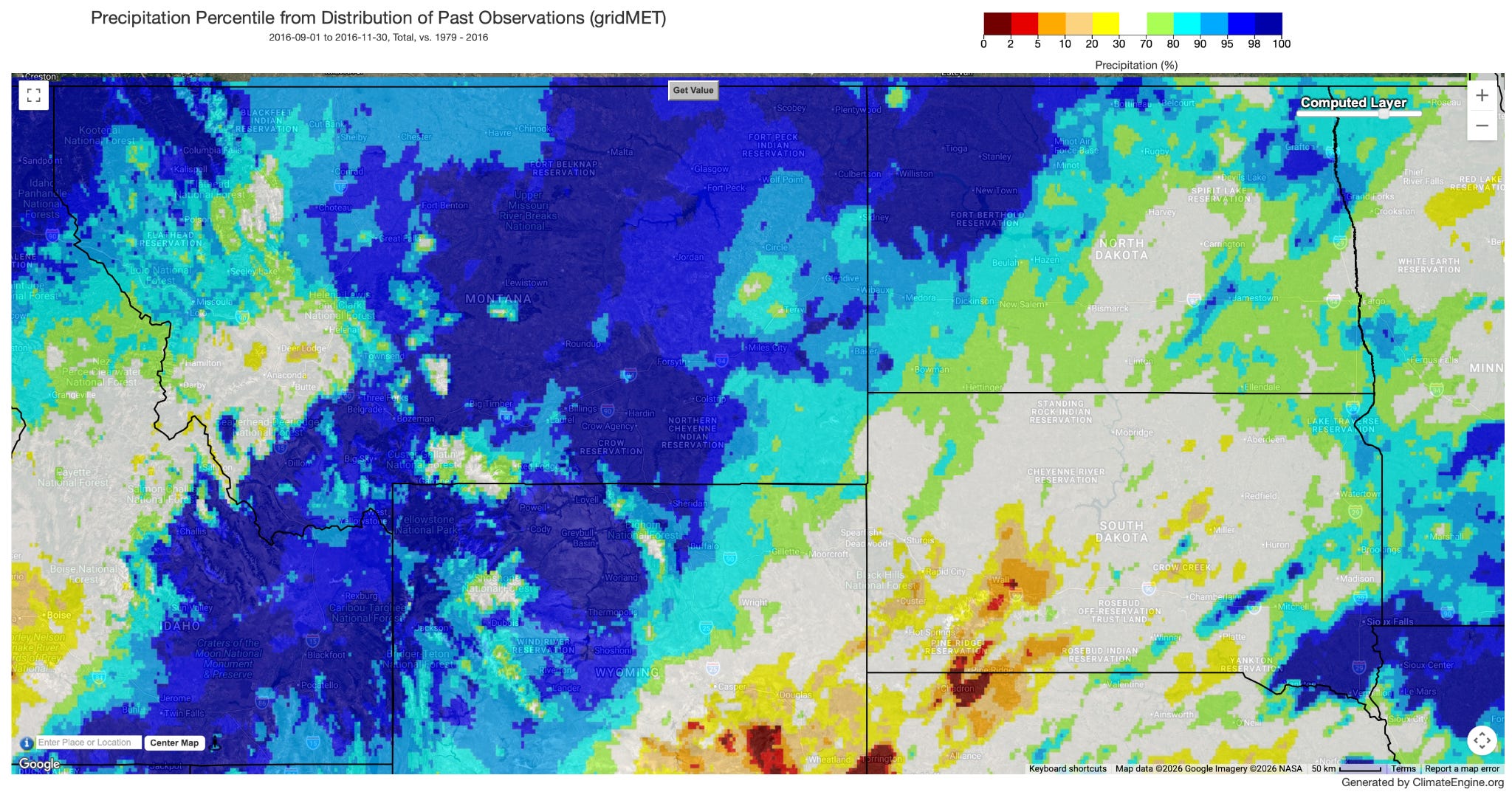
Precipitation Percentile
Head to app.climateengine.org
Click on the Make Map tab on the left-hand panel.
Select Climate & Hydrology as the Type input. Select GridMET - 4km - Daily as the Dataset input. Select Precipitation (PPT) as the Variable input.
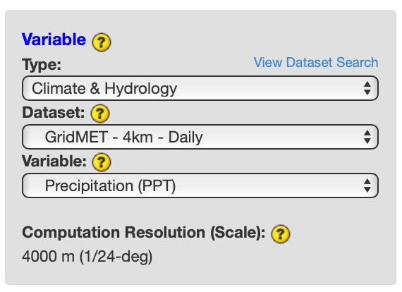
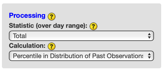
Select Total as the Processing Statistic (over day range) input and Percentile in Distribution of Past Observations as the Calculation input. Skip the optional Masking section.
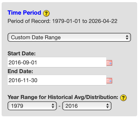
Select Custom Day Range as the Time Period. For Start Date input, select 2016-09-01. For End Date, select 2016-11-30. For Year Range for Historical Avg/Distribution, select 1979 and 2016. Click COMPUTE MAP to submit your selections.
Over the right map panel, click on Map Overlays. Under the Vector section, expand Boundaries > US (Contiguous States) and check on US States.
Repeat process for following time periods: September - November 2016 (https://climengine.page.link/7B4R ), April 2017 (https://climengine.page.link/gMMw ), May 2017 (https://climengine.page.link/HYv6 ), June 2017 (https://climengine.page.link/eJyb ), July 2017 (https://climengine.page.link/8okp ), August 2017 (https://climengine.page.link/RCbi )
Output:
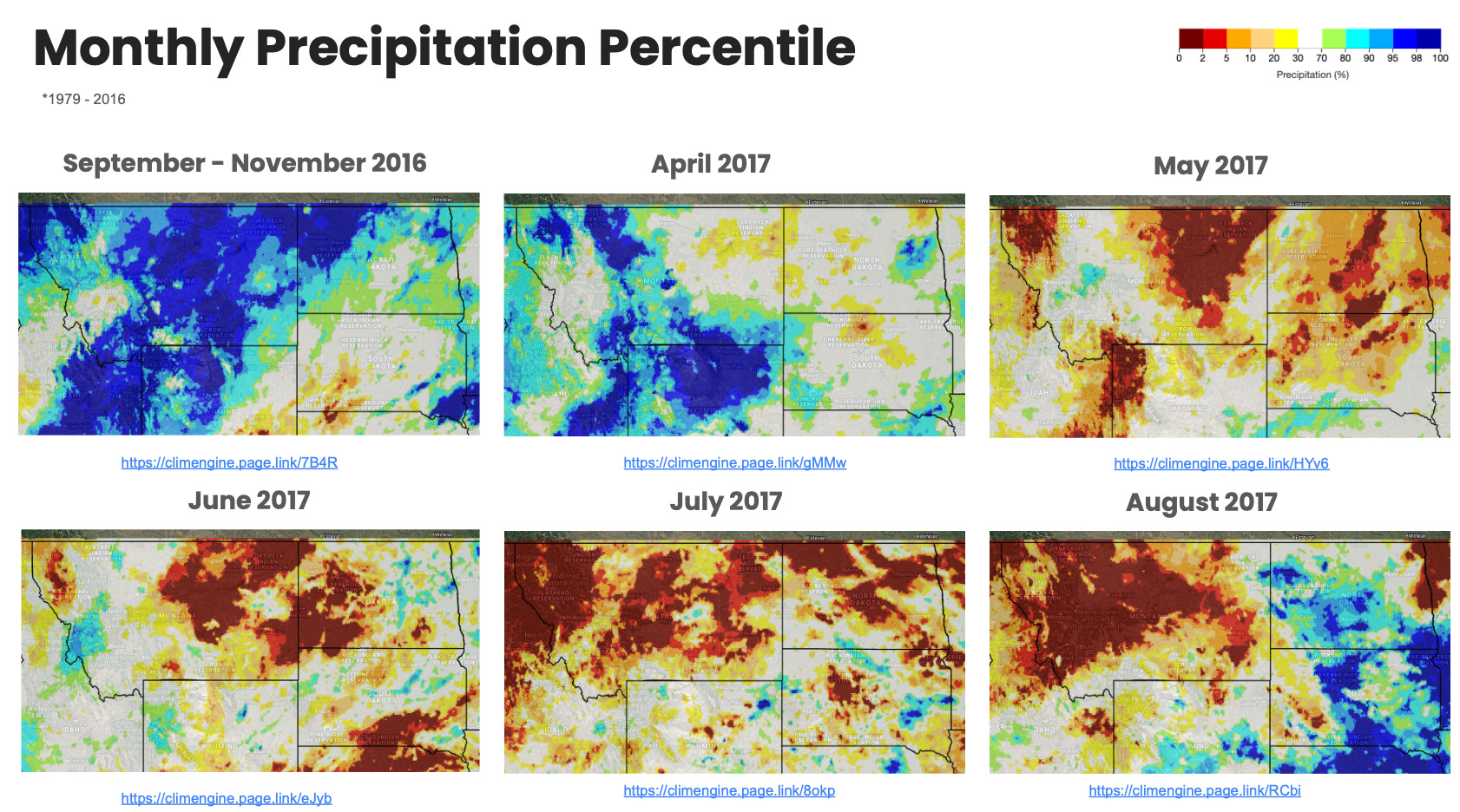
This series of maps highlights the above normal precipitation in the preceding fall and abrupt near record low precipitation during summer months.
Temperature Percentile
Head to app.climateengine.org
Click on the Make Map tab on the left-hand panel.
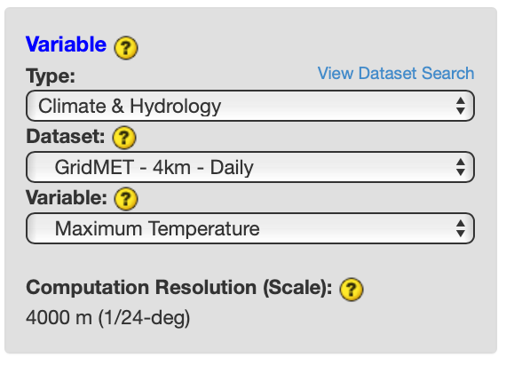
Select Climate & Hydrology as the Type input. Select GridMET - 4km - Daily as the Dataset input. Select Maximum Temperature as the Variable input.
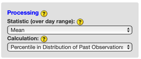
Select Mean as the Processing Statistic (over day range) input and Percentile in Distribution of Past Observations as the Calculation input. Skip the optional Masking section.
Select Custom Day Range as the Time Period. For Start Date input, select 2016-09-01. For End Date, select 2016-11-30. For Year Range for Historical Avg/Distribution, select 1979 and 2016. Click COMPUTE MAP to submit your selections.
Over the right map panel, click on Map Overlays. Under the Vector section, expand Boundaries > US (Contiguous States) and check on US States.
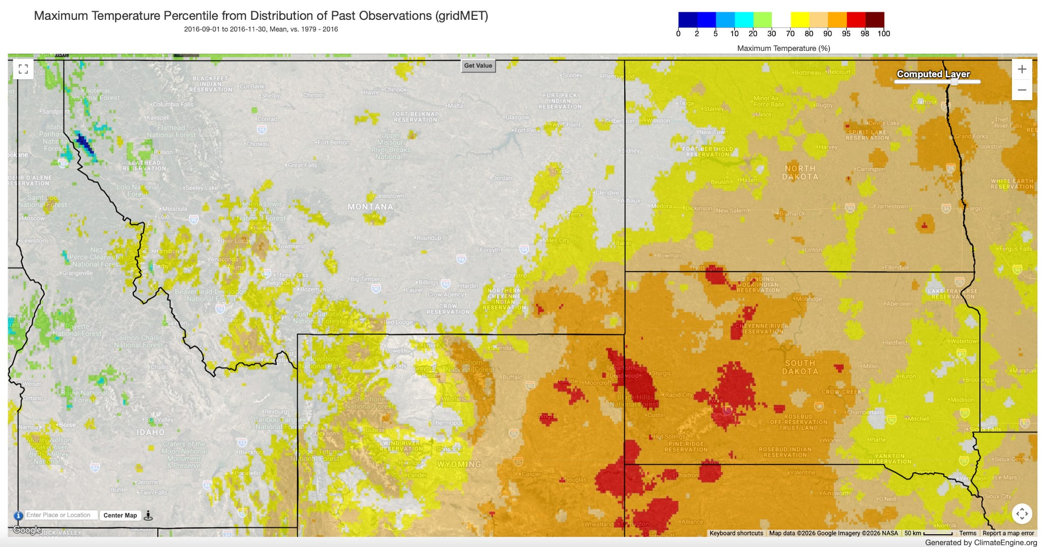
Repeat process for following time periods: September - November 2016 (https://climengine.page.link/naAM), April 2017 (https://climengine.page.link/edyN), May 2017 (https://climengine.page.link/C2EG), June 2017 (https://climengine.page.link/xCA3), July 2017 (https://climengine.page.link/9uQY), August 2017 (https://climengine.page.link/Va4c )
Output:
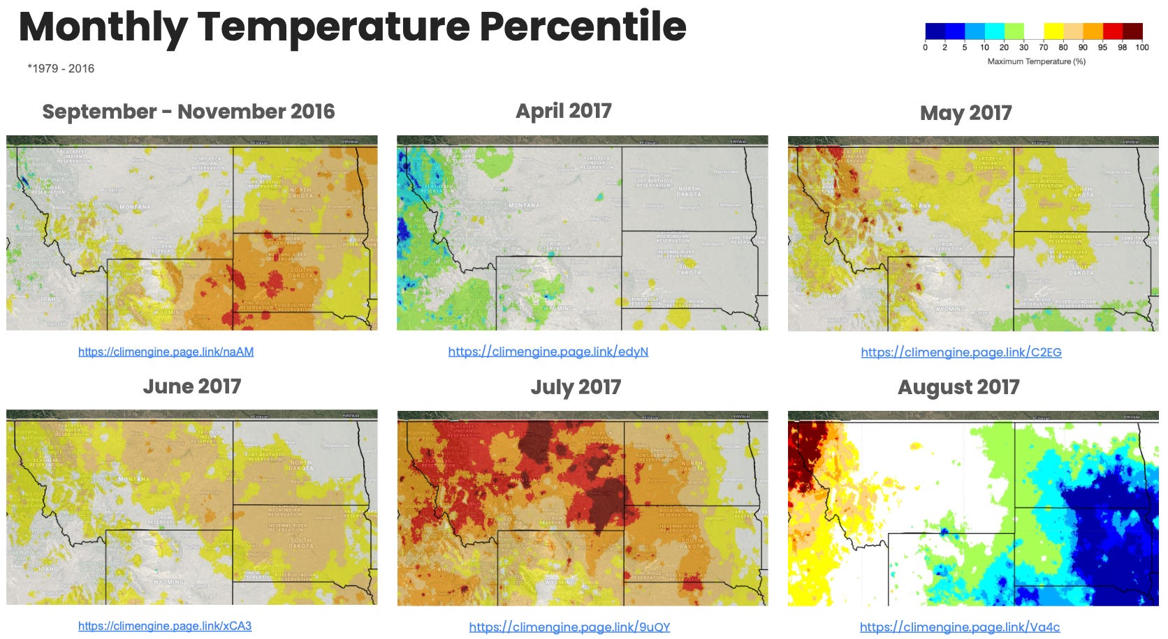
This series of maps highlights above normal temperatures intensifying in July, which in conjunction with the below normal precipitation, helped drive the flash drought.
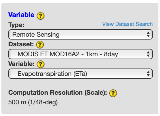
ET Anomaly
Head to app.climateengine.org
Click on the Make Map tab on the left-hand panel.
Select Remote Sensing as the Type input. Select MODIS ET MOD16A2 - 1km - 8day as the Dataset input. Select Evapotranspiration (ETa) as the Variable input.
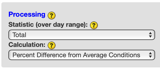
Select Total as the Processing Statistic (over day range) input and Percent Difference from Average Conditions as the Calculation input. Skip the optional Masking section.
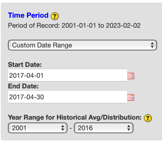
Select Custom Day Range as the Time Period. For Start Date input, select 2017-04-01. For End Date, select 2017-04-30. For Year Range for Historical Avg/Distribution, select 2001 and 2016. Click COMPUTE MAP to submit your selections.
Over the right map panel, click on Map Overlays. Under the Vector section, expand Boundaries > US (Contiguous States) and check on US States.
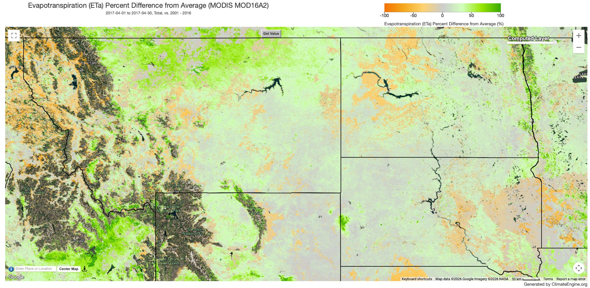
Repeat process for following time periods: April 2017 (https://climengine.page.link/qf2c), May 2017 (https://climengine.page.link/mEKH), June 2017 (https://climengine.page.link/SQFP ), July 2017 (https://climengine.page.link/YqQG), August 2017 (https://climengine.page.link/HNKH), September 2017 (https://climengine.page.link/D3sk)
Output:
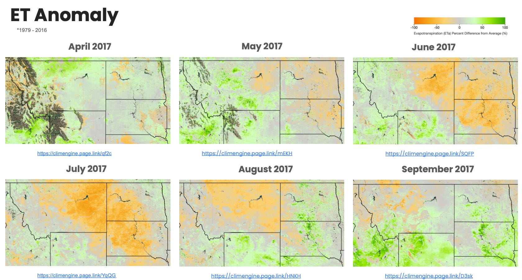
This series of maps highlights a rapid decline in evapotranspiration amounts from May into June and July from the lack of precipitation.
Other Datasets to Explore
VegDRI (https://climengine.page.link/885o)
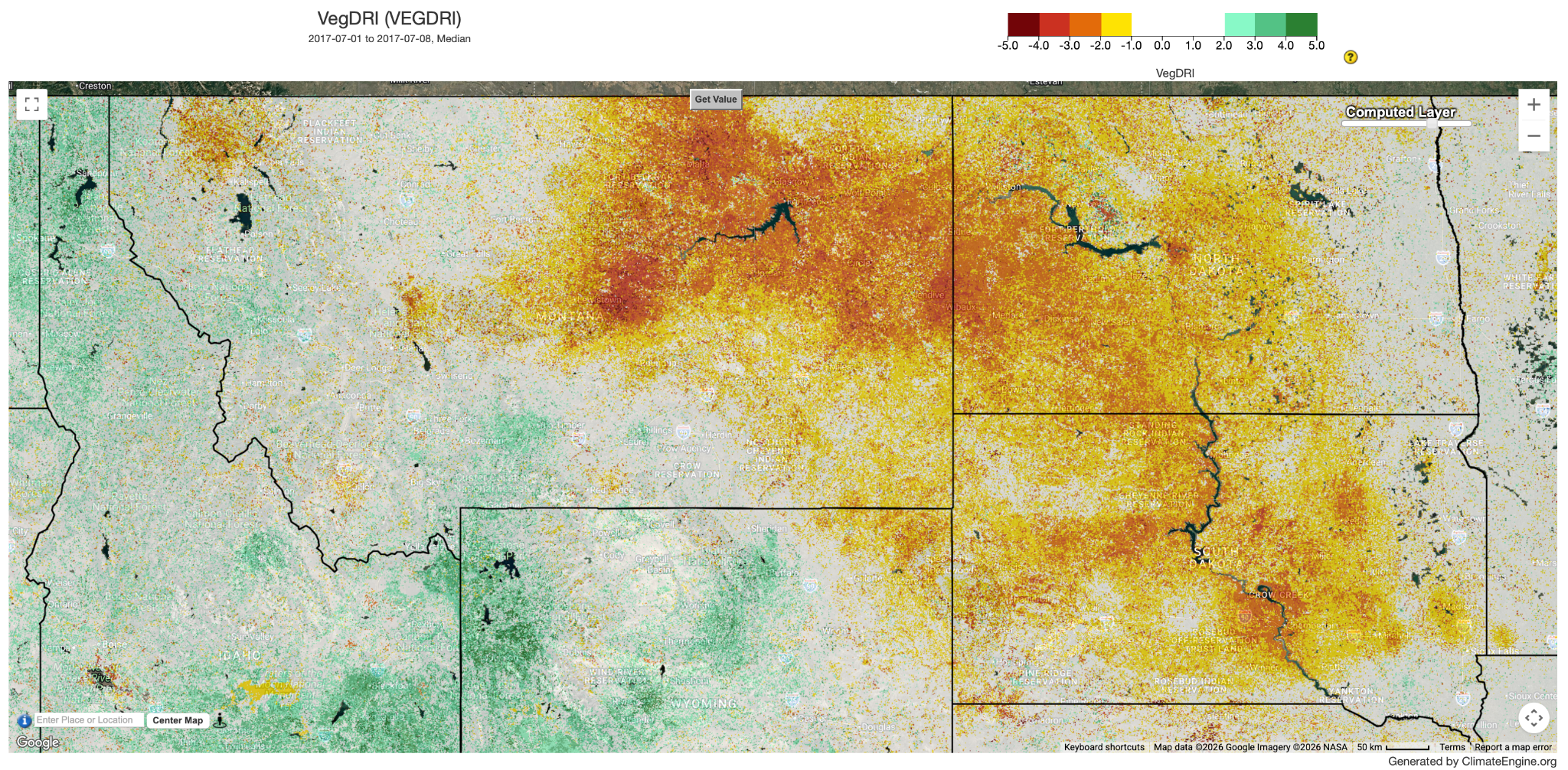
This map shows widespread vegetation in moderate/severe drought during July 2017.
Evaporative Stress Index (ESI) 4-Week (https://climengine.page.link/WVFA)
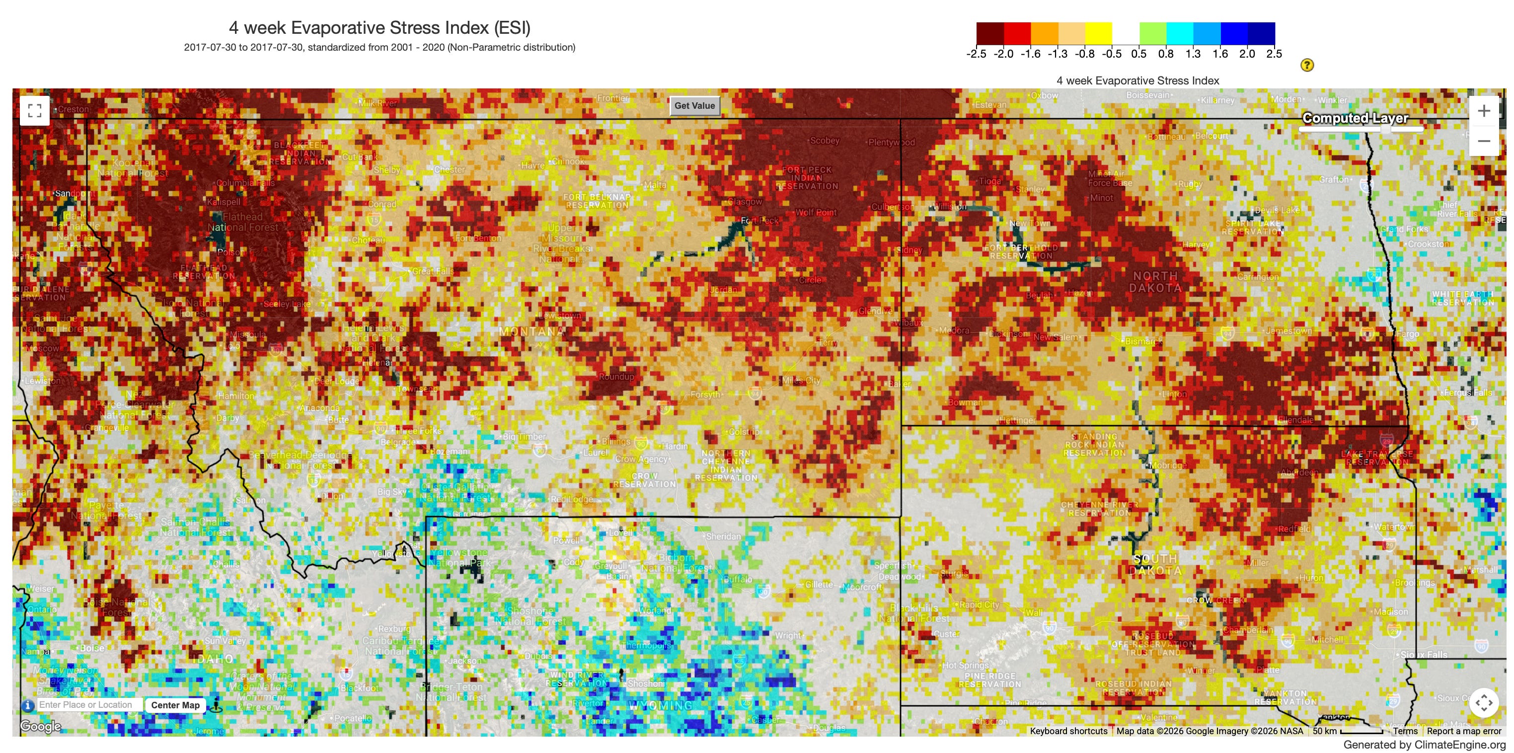
This map shows widespread exceptional/severe drought during July 2017.
gridMET Drought 30-day EDDI (https://climengine.page.link/bKqH)
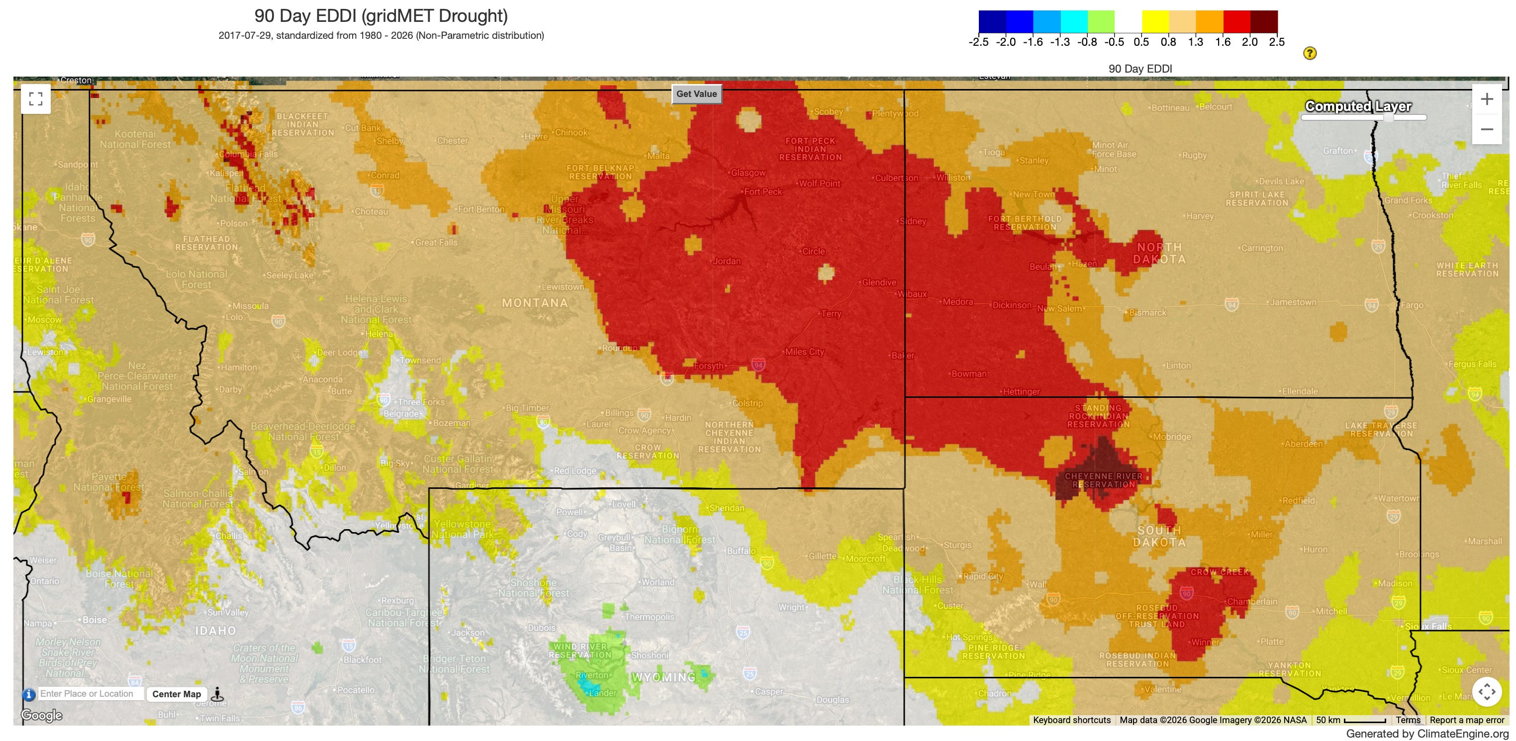
This map shows evapotranspiration driven severe drought May - July.